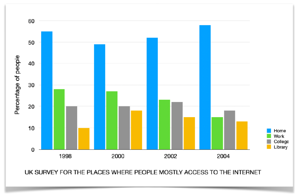

What the bar graph presents is a general picture of UK’s Internet access covering four different places. Documented by precise percentages, the graph communicates several clear messages.
According to the graph, people’s home boasted the highest Internet service coverage rate across the targeted years. Although the rate experienced fluctuations, swinging up and down from 55%, 48%, 52% and to 57% in between, the overall rate of coverage outdid those of other environments.
Another message communicated is that broadband service coverage at work was statistically on a constant decline during the period. Though standing at a relatively substantial coverage rate of 28%, it then inched to 26% in 2000 and eventually dived/hit the rock-bottom to only 13% in 2004.
When it comes to the remaining two regions, the situation is ____somewhat _____ different. While the Internet coverage rate in college stood still in the first two years, it then climbed to 24% and yet lost much momentum, sinking to 15% in 2004.
Last but not least, the Internet coverage rate in library appears the least promising. Although the rate leapt from 11% to 17% in the 1998-2000 period, the figure in each period never crossed the threshold of 20% while it again dropped to the insignificant 12% in 2004.